

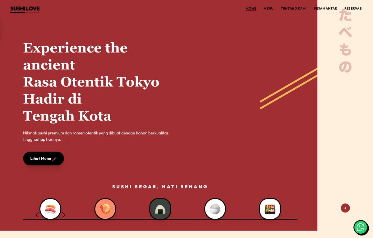
The Menu Is the First Thing They Want to See. So That's Where This Template Starts.
Restaurant visitors are often choosing between two or three options at the same time, on their phone. The one that loads slowly, hides pricing, or buries the order button loses that table to whoever didn't. The Tokyo Bites template puts the menu front and center: full categories on first scroll, prices visible without hunting, and an order or reservation path short enough to close the decision before the moment passes.
Who This Is For
Single-location Japanese restaurants and similar dine-in establishments serving diners who are actively researching where to eat tonight, with a menu spanning main course, appetizers, desserts, and beverages plus promotional set meals and bundles. The template is built for restaurants positioned as authentic dine-in experiences competing against other restaurants and delivery platforms like GoFood and GrabFood, where the choice between sitting down for a meal and ordering in is decided on whichever menu loads faster and reads clearer. Market context: food discovery now happens on Instagram and Google Maps on mobile, often minutes before the diner walks out the door, so the restaurant that surfaces its menu, price, and reservation path in the first ten seconds wins covers that competitors lose to a third-party delivery interface.
What This Template Covers
- Visual Menu by Category: Each food and beverage section lands with high-resolution photography optimized for mobile bandwidth. Dishes look worth ordering before the price is even checked.
- Promos Positioned to Convert: Bundle deals and set menus surface before the full category list, not after, so a higher-value order feels like the obvious choice, not an upsell.
- Mobile-First Order Flow: Large tap targets, a menu accessible from any page, and the fewest possible steps from selecting an item to confirming an order. Designed for thumbs at a dinner table, not a cursor at a desk.
- Separate Dine-In and Takeaway Paths: Reservation and delivery flows stay distinct. Neither group has to navigate the other's process to do what they came for.
- Zero Runtime JavaScript: Built with Astro, deployed on Cloudflare's global edge. The full menu is visible on first scroll on mobile with nothing executing in the browser, which is why Core Web Vitals hits 97/99 on both mobile and desktop.
Full Site Architecture: 5 Pages
Five pages, one job. The menu and reservation paths have no dead ends from the homepage; the about page answers who cooked it and why, the contact page handles directions and walk-ins. Every section routes to the same endpoint: a booked table.
restaurant/
├── /                           HOME
│   ├── [Hero]   Signature dishes + dining atmosphere
│   ├── [§]      Menu highlights: featured dishes
│   ├── [§]      Promo packages: set meals & bundles
│   ├── [§]      Reservation & delivery CTA
│   └── [CTA]    Reserve a Table / Order Online
│
├── /menu                       DIGITAL MENU
│   [§] Main Course · Appetizers · Desserts · Beverages
│   with descriptions and prices per category
│
├── /reservations               DINE-IN RESERVATIONS
│   [Form] Date · Party size · Special requests
│
├── /delivery                   DELIVERY & TAKEAWAY
│   [§] Delivery areas · Minimum order · Ordering platforms
│
└── /about                      ABOUT THE RESTAURANT
    [§] Story · Chef profile · Signature dishes origin
─────────────────────────────────────────────────────────────────
[Hero] lead section  ·  [§] content section  ·  [CTA] conversion point
digital menu  ·  reservation form  ·  delivery info
Independent Verification
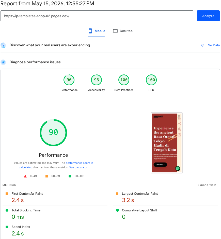
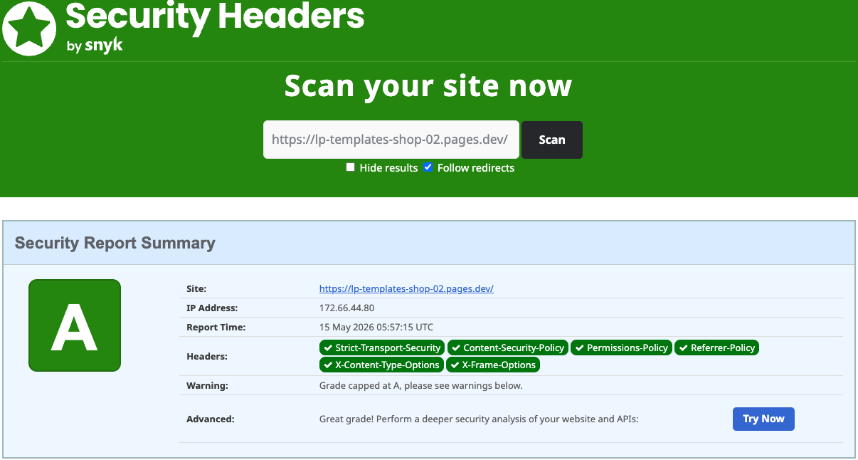
Both reports were captured on the live site, not a staging environment. Click either image to run a fresh scan yourself.
Google's public tool for measuring real-world web performance. It scores pages across Performance, Accessibility, Best Practices, and SEO. Each category is scored out of 100. A score of 90+ is considered good; this site scored 97 on mobile and 99 on desktop.
An independent scanner that checks which HTTP security headers a site has configured. Headers like CSP, HSTS, and X-Frame-Options protect visitors from common web attacks. Grade A means all major headers are present and correctly set.
How to Evaluate the Demo
- Menu speed: Open the demo on your phone and time how long it takes to read a dish name and its price. That's the test, not the desktop, not WiFi. A hungry diner on 4G won't wait.
- Promo section: Do the bundle or set menu deals appear before the full menu, or after? And when you read them, do they feel like a good deal, or like something that needs explaining?
- Order flow: Tap through the full order path. Count the steps from finding a dish to confirming the order. Compare that count against a competitor's site.
- Dine-in vs. takeaway: Can a walk-in wanting to reserve a table and a delivery customer find their respective flows without crossing paths? Try both and note where they diverge.
- Accessibility: Open PageSpeed Insights on the demo. Headings, contrast ratios, alt text, and keyboard navigation all pass automated accessibility checks.
- Security: Run the SecurityHeaders.com scan above. Grade A means every visitor is protected by the full set of HTTP security headers: CSP, HSTS, X-Frame-Options, and more.
"Diners decide in seconds, not minutes. A menu that loads slowly or prices that are hard to find don't just cost a click. They cost a table that was already decided."